After all these years, it still haunts my nightmares. Black eyes stare beadily; a garish red tongue pokes out of a slivered smile. Moldy green fingers grasp at air. Clouds cover the sun. And one phrase traces itself in an ancient script: “graphic design is my passion.”
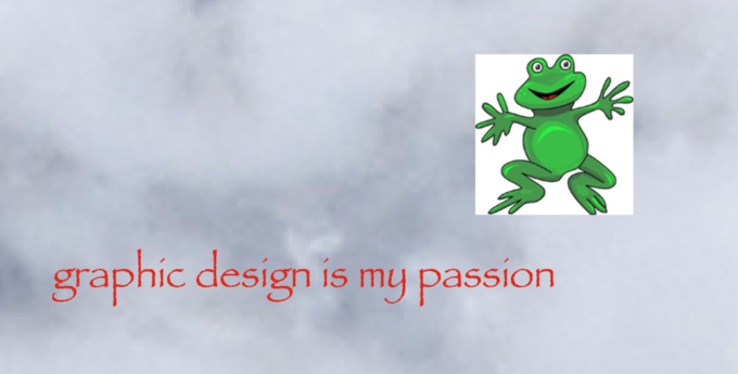
In July of 2014, Tumblr user Yungterra posted the very first version of the “Graphic Design is My Passion”meme2. Would this image bring shame upon any self-respecting designer? Absolutely. But it’s tough to pinpoint what exactly makes “Graphic Design is My Passion” so awful. Some viewers have blamed its use of the hated font Papyrus3. Others have found fault with its aggressively unedited clipart frog. I have sympathy for both of these claims, but I don’t think that either quite captures why I loathe the image.
No, what bothers me most about “Graphic Design is My Passion” is its structure. In my extensive (fine, highly limited) design experience, I’ve learned that creating a graphic is quite like writing an academic essay. The designer has a key idea that she wants to convey to her viewer, and she uses her text, images, and backgrounds as evidence for that key “thesis.” These components of her graphic, much like the paragraphs of an essay, need to fit together in a particular way. In essay writing, this concept is sometimes called “arc”: an essay with a strong arc has paragraphs that build upon and blend with each other. Even as each paragraph makes a unique contribution to the thesis, it also hangs together with the paragraphs before and after. A graphic may not have an arc in the same way an essay does, but the best graphics do seem to have a kind of structural harmony. The text and images are individually compelling, yes, but what makes the graphic work is the way those elements fit together. In an ideal graphic, the text supports the images and the images the text.

Unfortunately, “Graphic Design is My Passion” displays no such harmony. In fact, it seems designed to ensure that no viewer could unearth even the ruins of an underlying structure. Consider the frog. Neon-green and cartoonish, it is the exemplar of modern Internet clipart. Why, then, would it be paired with Papyrus, a font meant to mimic ancient writing? Perhaps the red text and green frog are meant to form a complimentary color combination— but then why include a dissonant gray sky in the background? Thematically, the frog and sky don’t match up either; amphibians are creatures of the land and water, not of the air. If anything links these disparate components of the graphic, it is far from obvious.
If a harmonious graphic is like an essay with a strong arc, to what might we compare the chaos of “Graphic Design is My Passion?” I suspect that the best analogue is the standard five-paragraph essay. Of course, most five-paragraph essays don’t have body paragraphs that actively disprove their thesis. Papyrus was my favorite font as an eight-year-old, for instance, but nobody with a “passion” for graphic design would share that opinion. Still, when I hear a professor or a peer take issue with a five-paragraph essay, the complaint is invariably that the essay lacks an arc. Even if each body paragraph adds to the thesis, it is unclear what connects the arguments in each paragraph. The reader is left to ask herself why the sky paragraph comes after the frog paragraph—and if changing this order would make any meaningful difference in the essay. Many five-paragraph essays are thus undermined by the same lack of harmony as “Graphic Design is My Passion.”
Next time you consider this cursed image, then, spare a thought for your own writing. Ask yourself what you can do to make your arc more compelling. When you have a sky paragraph and a frog paragraph with no discernible connection, consider how each paragraph’s ideas relate to the next. If you can’t find a relationship, it may be worth rethinking your structure. Yes, compared to worries about thesis and evidence, these concerns about arc may seem minor. But as “Graphic Design is My Passion” reveals, a strong arc can make an essay a dream; a weak one can make it a nightmare.
— Natalia Zorrilla, ’23
You must be logged in to post a comment.